Time Logging Application
UI/UX Design
I was hired as a UX/UI Pipeline Design Intern for Method Studios, a VFX Company in Vancouver. Tasked to help design a time application, I used my skills to further the user's experience and work in a professional setting.
Part 1: Context
Building with Artists and Administrators in Mind
When I started out I was eased into the situation: The studio was creating a new time logging application customized for the Visual effect industry. It required custom design and development that would be used at Method Studios's Worldwide locations. Throughout my time I focused on 4 objectives: The application in the eyes of the Artists, the application on the artist side, user support, and feedback gathering/testing.
My Role:
UI Design, Collaborator, 1-on-1 Interviews, Interaction Design, Sprint Planning, UX Design, Feedback Review, Low/High Fidelity Prototyping, Consulting, Research
Tools: Pen and paper, Sketch, JIRA, Internal Systems
Part 2: Process
Focus Area: Time Application for Artists
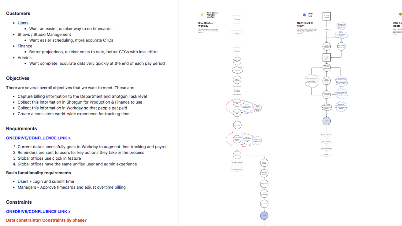
Designing for VFX Artists, I caught up with the already existing application that was used and what was already done before starting off. I familiarized myself with what we are targeting, what objectives we are aiming for, the requirements for stakeholders, and constraints that is given.
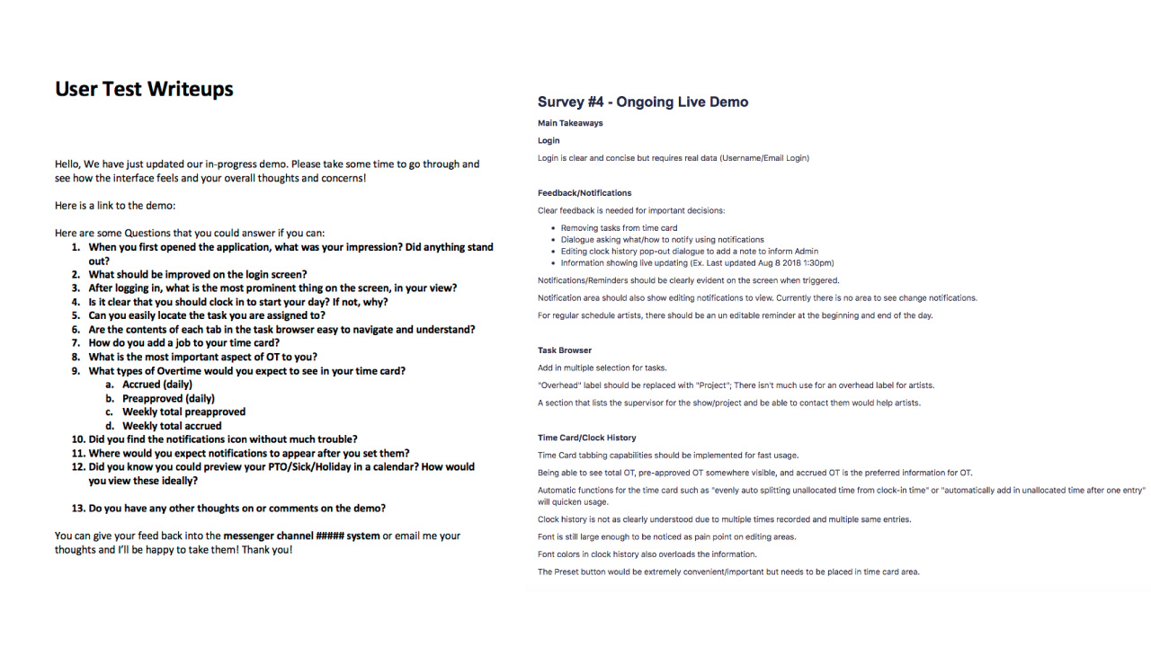
Once understood, I created new surveys and user test write-ups to be used in interviews. I was the only person at the Vancouver office working on this project so I was the point man to administer the tests in person. Having in-person feedback gathering allowed me to get information faster and reliably compared to video call.
With information gathered, I distilled the data with my senior and created updates to the UI and made prototypes as part of the ongoing agile sprints developing the application.
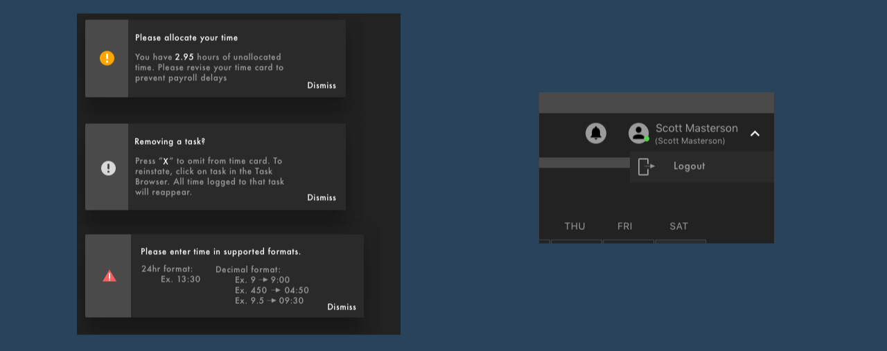
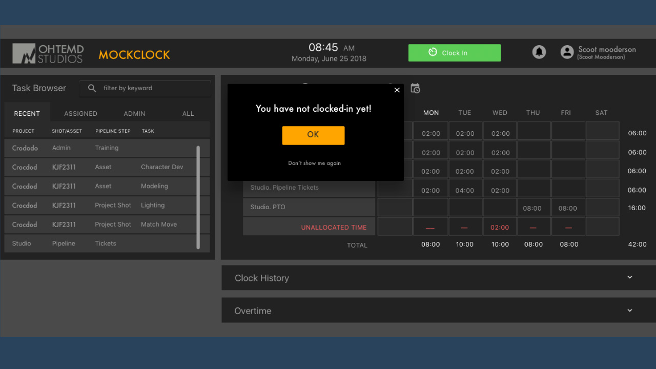
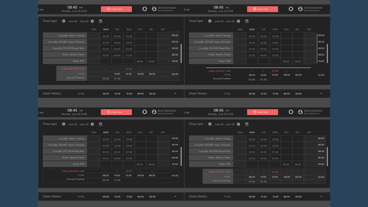
There were many features that tweaked with each iteration for usability and efficiency. Material design handed down by the front-end developer was always kept in mind to ensure that the designs were following process.
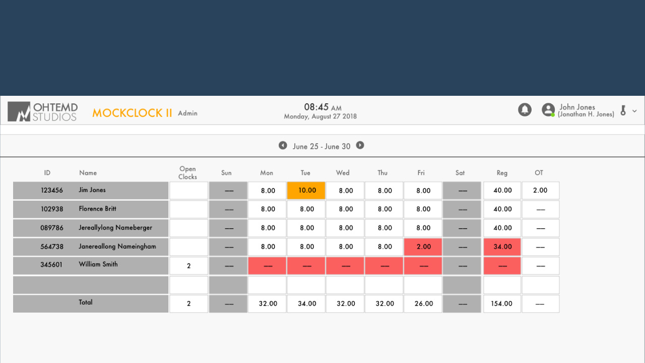
Focus Area: Time Application for Admins
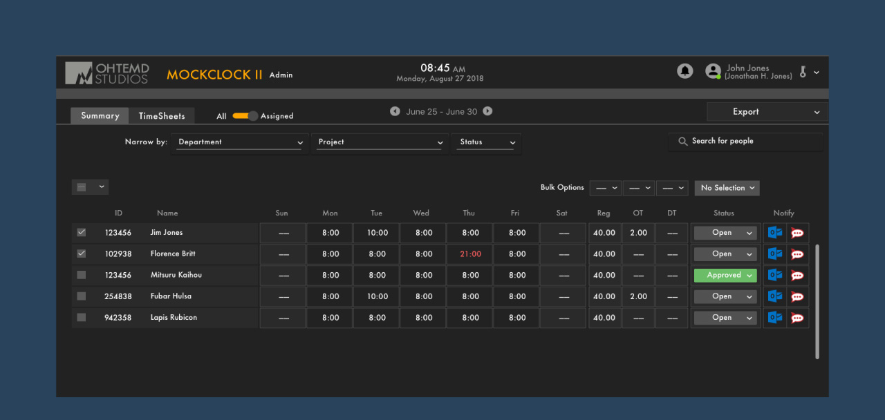
The latter part of my Internship had me create designs for the administrator side of the application. It focused more on design aspects such as use cases, requirement clarification, user flows, and UI design.
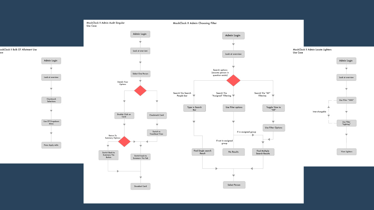
Understanding the user flow and action they would take was important. Each use case was incorporated into my designs.
With my senior, I refined and iterated through multiple designs and showed them off to see if they could help make clear what the administrator side needs and fit into the material design of the system.
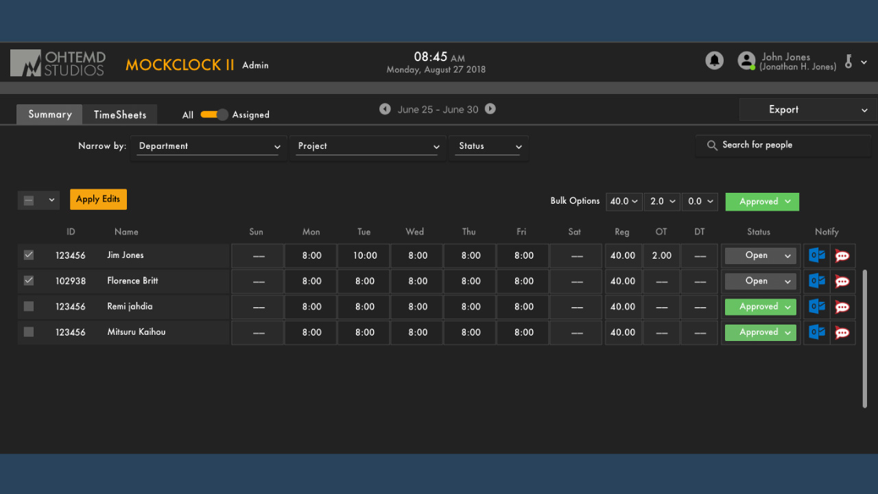
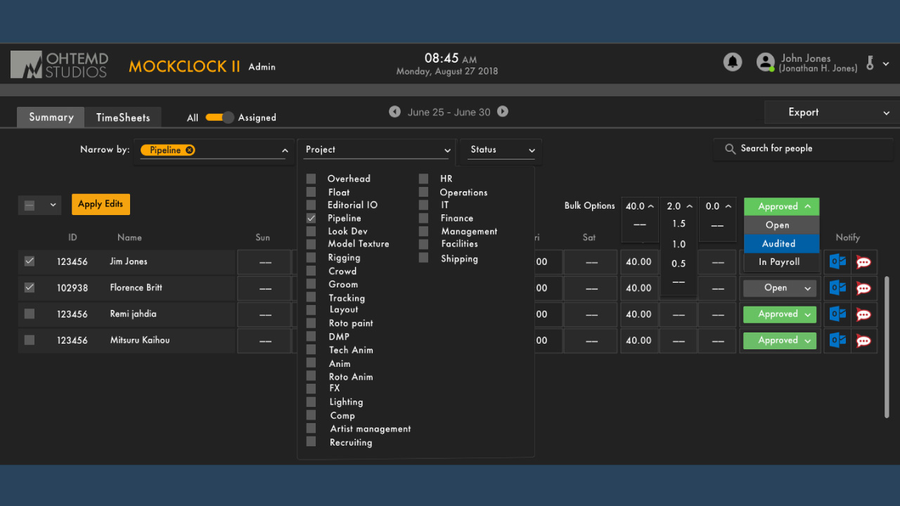
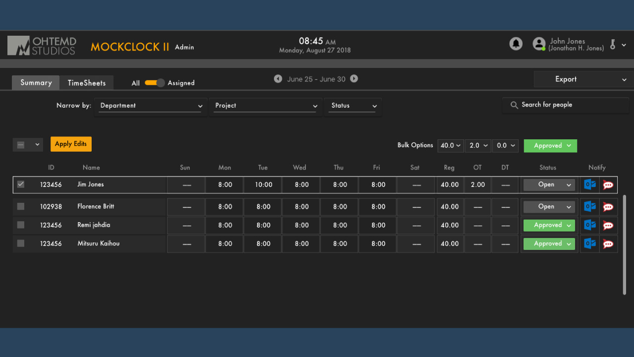

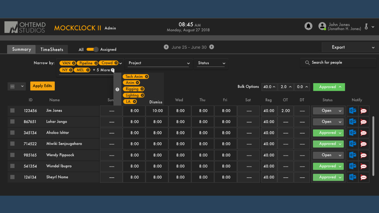
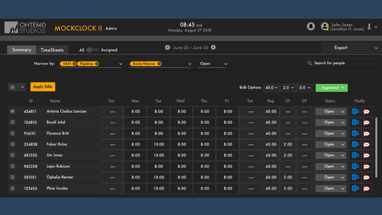
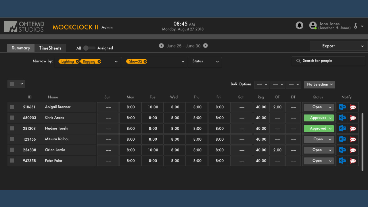
I used Sketch to create multiple screens on what each step might look like for the design. These were used by my senior to review and see if the user experience was understood.
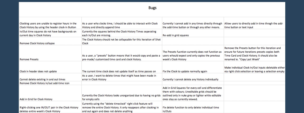
Focus Area: On-boarding Assist and UI/UX Testing per Sprint
The last large part of my tasks involved testing the developed prototype. Finding bugs and ensuring the user experience was sound during each sprint ensured that the application could go on to the next step.
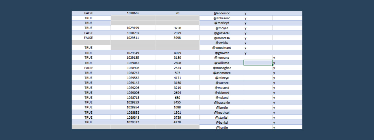
As part of the testing, I prepared, with the project manager, lists of users to test with so future testing could be done quickly and useful.
Part 3: Reflections
A User Advocate at Every Step
Each of my focuses and work was geared for a good user experience. I was able to use my skills in a professional environment and forward the company's goals and efficiency. Advocating for the user, I was able to actively introduce part of the time logging application to my department at the end of my internship.
Personally, I learned a unique experience collaborating wholly with an international development team of managers, UI/UX designers, and developers. I was able to use my knowledge well and confirmed my desire to work for users as a career.
